Georgia Tech Rebrand
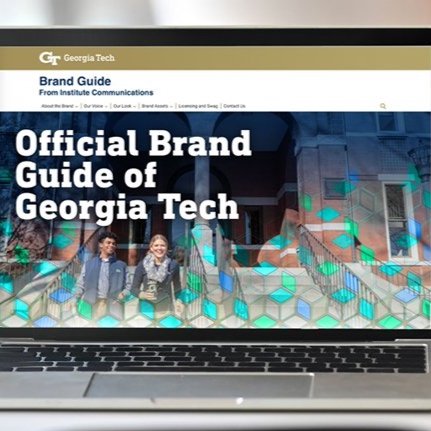
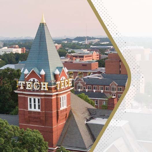
In 2021, the Georgia Institute of Technology refreshed its brand identity for the first time since the 1996 Olympics. I served as one of the lead designers on the internal, cross-departmental creative team. We leveraged community equity in Institute symbols and the athletic brand mark to create a new identity system — combining legacy with bold new colors and design elements to unify the Institute’s messaging of “progress and service” and bring it into a new decade.

New Georgia Tech primary logo

Previous Georgia Tech logo lockup

Existing Georgia Tech Athletics logo
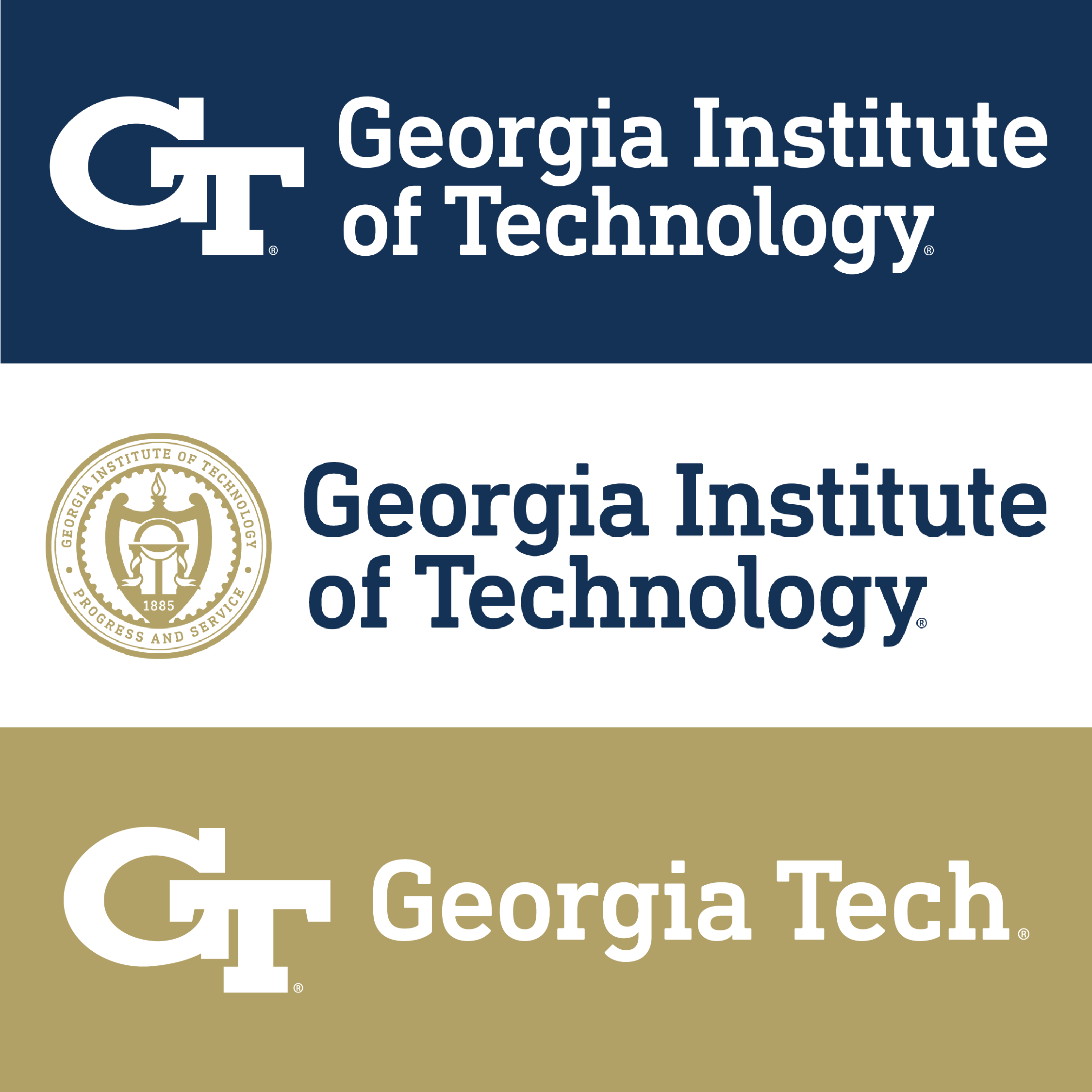
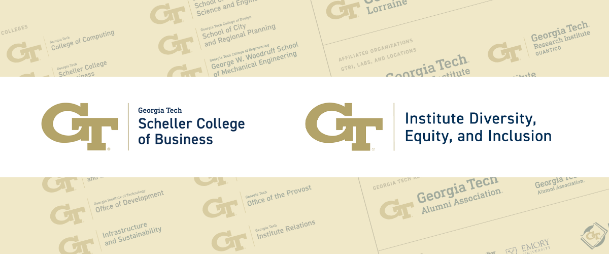
The previous logo only had two versions: standard and using the full name of the Institute. A primary goal of this rebrand was to increase the flexibility of the lockup for use in a variety of use cases, from a button to a billboard.
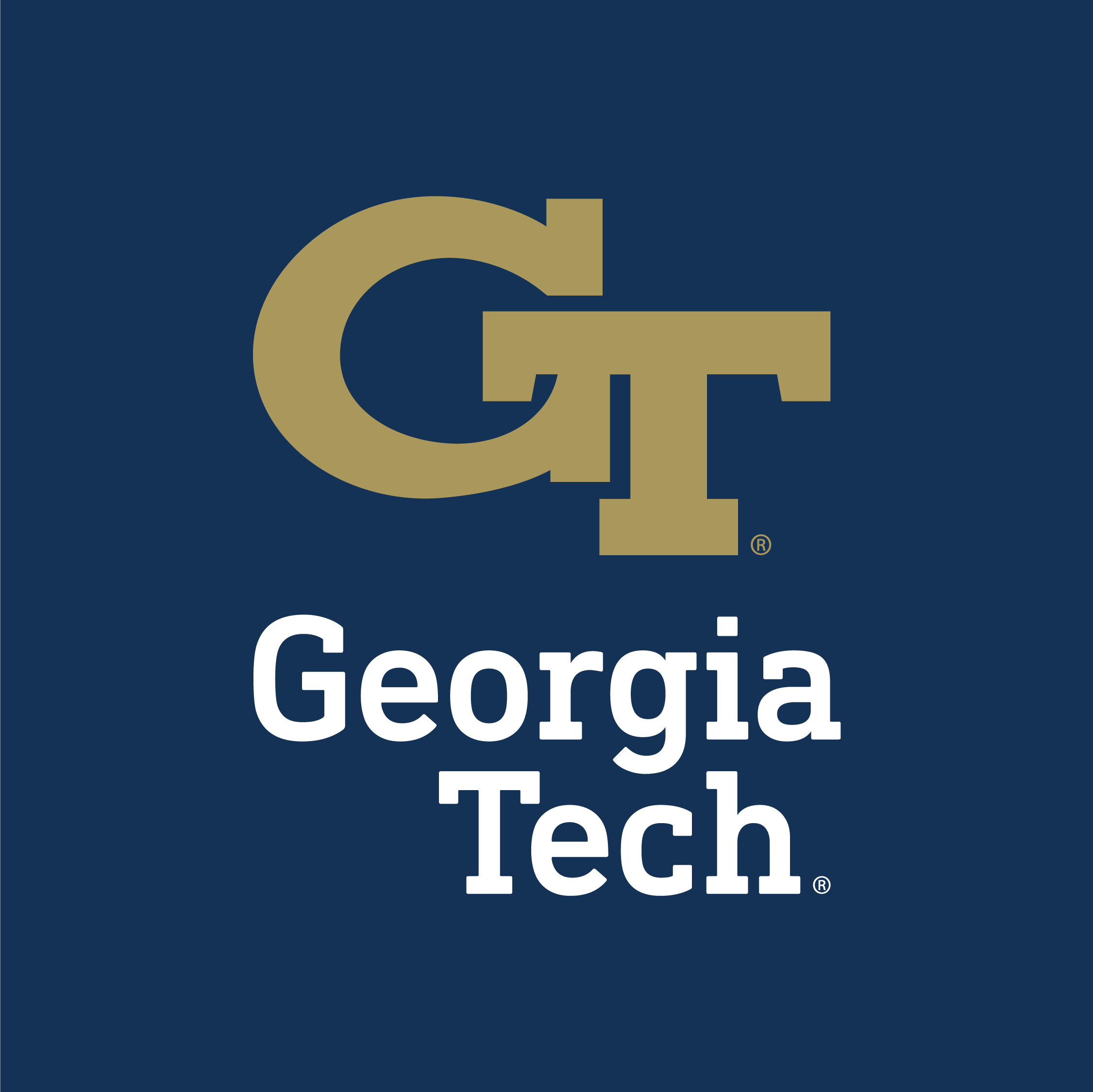

Alongside the traditional white and gold, navy was introduced as a primary color, and accompanied by a bold set of tertiary colors and design elements born from the geometry of a yellow jacket hive.






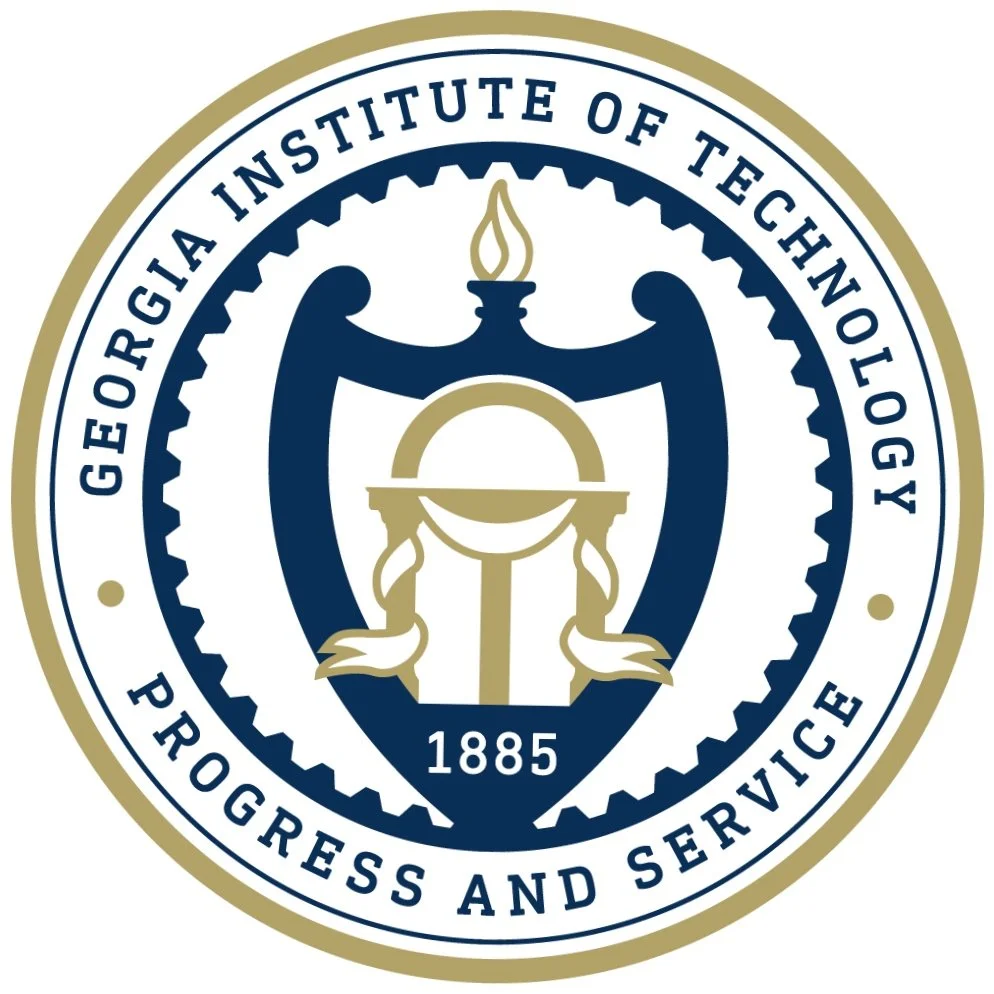
The official Institute seal was also redrawn and simplified for better reproduction at all sizes, both in print and digitally.



A collection of print collateral cover designs that show the variety in the visual language.


Tech Square website homepage
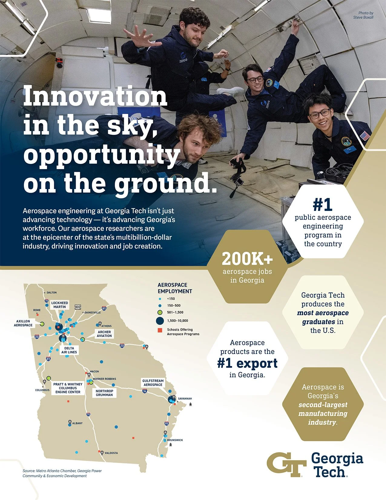
James magazine ad
